.jpg)
Post Up
Design Sprint Prompt
The Design Sprint method is a 5-day approach to address critical business inquiries by creating solutions and testing prototypes with users.
Post Up, a mobile application, offers remote workers and freelancers curated workspace recommendations to facilitate comfortable remote work. This service comes with a monthly subscription fee of $5.99.
Problem
Post Up is a startup aiding remote workers in discovering suitable coffee shops and public workspaces. However, the app only presents potential locations without comprehensive details, leading users to arrive and find spaces unsuitable for their needs.
Solution
Addressing this, streamlining the user experience would involve providing location details, workspace characteristics, and proximity information, to respect the user's time and requirements.

Design Sprint Timeline
Day 1
Understand
From Post It's current users, I had to reevaluate their needs by different methods to determine possible solutions.

Constraints
1. Post Up is a mobile app.
2. Post Up wants to help users find places that already exist.
3. Post Up wants to charge a monthly subscription fee of $5.99 to users in exchange for access to Post Up information.
Synthesizing
I was able to synthesize by using post-its of what users have been saying, used "How Might We" questions, and took on the perspective of a user by focusing on what their goals are so that I can understand and map out possible solutions.

The Post-it method helped to organize what the users were saying, how they felt, and what they hope for.

To continue thinking from the User's perspective, I then framed the statement by saying "As a User" to accumulate possible goals.

Then I narrowed down solutions by asking "How Might We..." to create a possible foundation for how Users will interact with the Post Up app.
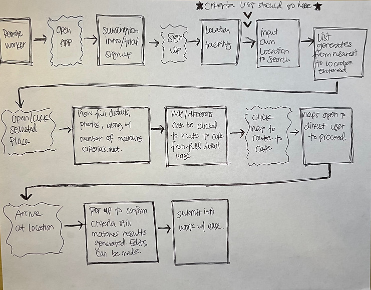
User Flow Chart
In the user flow chart, I have my Remote Worker in the top left-hand corner to start off each step they would take in the app.
Day 2
Define
Through Day 1 of learning, evaluating, and understanding Post Up user needs, I was able to establish user goals on Day 2 with a written-out lightning demo, inspirations, crazy 8 sketches, and the 3-panel solution sketch.
.png)
Lightning Demo
Since my drawing skills may compromise what I am trying to portray, I wrote out aspects of a variety of products and services from apps that have a wide range of users for my inspiration to structure my concepts during the design phase.

Inspirations
Since the target user audience is 30-year-olds and above, I was able to relate to and find general apps from the Lightning Demo stage that were inspiring to gain more insight from. I also noticed subjects of health, comparing gas prices, restaurant recommendations, and amusement parks were commonly referenced during casual conversations around me. Without a doubt, my inspiration board was curated with those apps in mind since it is familiar and can lessen the learning curve when applied to Post Up.
Inspiration Board
1. Gas Buddy
The search bar is important to find the closest gas station with knowing the cost of each station.
Post-Up would be based on the user's input, their opinions impact the search results, hence why I saw Gas Buddy inspiring my design steps.
2. Pilates By Kerstin
I appreciated the welcome page introducing the free trial because it doesn’t feel forceful, but welcoming by giving the app a try to see if useful or not. This page shows character by showing the politeness of the app.
1.

2.

3. Pilates By Kerstin
The subscription page option was simple with two different options. This is a smooth transition from the welcome page where it stays in line with being considerate of the user not feeling pressured to purchase.
3.

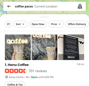
4. Yelp
Yelp was also an important site because it lists by location of preference once a place is selected. I saw how an interactive map on the same page with details of the selected place was essential for the user to quickly scan details and have the option to start the user’s plan of action.
4.
5. Disneyland
An amusement park with all the wait times labeled on the map is an easier way to quickly view from a broader perspective. Also when you click on one of the ride’s wait times you can view more details with a simple preview. I saw that those under a time constraint may access the map more quickly to view what is most fitting but also access criteria details that meet the user’s needs.
5.

Sketch Exercise
From my inspirations gathered, I used the Crazy 8's Method to sketch and find eight solution variations to Post Up's obstacles that need to be addressed. I was able to quickly visualize a mini storyboard of a user's activity to achieve their goals. This helped build my foundation with different solutions that must be incorporated into my design along with being able to view with a broader perspective. I was able to sketch the eight pages with some ease.
Crazy 8's Sketching
In my Crazy 8's sketching phase, I quickly came up with eight different solutions that would be needed within the app.

Crazy 8's Sketching
From the Crazy 8's exercise, I chose one of the above solutions and created three panels to view a route the user would take when navigating this portion of the app.

Day 3
Ideate
After going through Day 2 Crazy 8's and focusing on the three-panel sketches, this set my design direction for Day 3 of ideating. Each screen has UX and UI elements that are necessary to complete the tasks so that a user can achieve their goals.
_edited.png)
Post Up Sketches
From the Crazy 8's exercise, I was able to picture the main solutions and routes that a user can possibly take for them to navigate their goals.
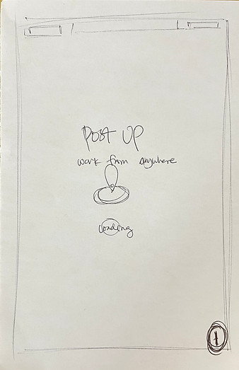


1) A remote worker decides to open up Post Up app by showing that it's loading to begin.
2) A free trial page is introduced to inform Users that they can try it out but it is a paid subscription-based app to use.
3) The user can choose a subscription to make it easier for them if they continue from the trial.


4) Sign-up / Log-in page by providing a variety of options to ease the sign-up / log-in process.
5) Google email provides the user's account to connect without thinking twice about it.
6) The notification is to double-confirm that the User is continuing to allow Google to share information with Post Up.

7) The user fills out the criteria list and checks off their workspace expectations.

8) The current location or another location can be inputted to help with search results.

9) Post Up notifying the user that their device location will be accessed, but allowing users to choose when.

10) Once the location is entered, suggested results are listed to choose from.

11) A list generates with indicators showing the level of compatibility to the user's criteria list.

12) When one of the locations is chosen, a quick preview can be viewed.

13) After clicking a location, full detail about the cafe is viewable with photos and your criteria list.

14) Clicking the address opens up a guided route to start at the location.
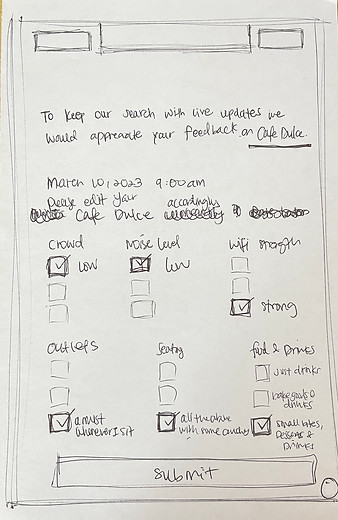
15) Once arrived at the location, the criteria list can be updated or left as is to keep results accurate.

16) After submitting the feedback a thank you pops up to confirm that it was well received.
Day 4
Prototype
Sketching high-fidelity designs to test users if the solutions do help lessen the time spent searching for a place to work.
.png)
UX/UI Hi-Fidelity Prototype
From Day 3 wireframe sketches I created high-fidelity designs to prototype my concept that is real enough to receive an authentic response from potential users. Since this is a design sprint with limited time, I only designed the steps I wanted to test instead of fully functional end-to-end routes solving every flow.

Day 5
User Testing Interviews
Having my concept tested by users would either validate or invalidate my possible solutions. Either way the feedback would improve the Post Up app.
.png)
User Testing
After finishing prototyping from Day 4, I had to find my users to test the prototype. What started as casual conversations with parents waiting at our kid's school pick-up area, my first five people volunteered out of curiosity and kindness. Since the volunteers are remote workers, we conducted Zoom interviews while they navigated the prototype on the Marvel app from a link I sent via Zoom chat.

Julie L.
38 yo / Fully Remote
Associate Marriage Family Therapist & Primary Therapist
"The app felt familiar like Yelp or one of those restaurant/store locators so it was easy to use."

Tyler J.
37 yo / Fully Remote
Associate Director
"It was easy to navigate, clear, and simple."

Noelle P.
30 yo / Fully Remote
Art Director
"I wouldn't have trouble finding a location to do my work."

Taryn P.
40-50 yo / Fully Remote
Customer Service Management (IT)
"I personally wouldn't need it (the app), but when students need a place to study this is great."

Roy K.
37 yo / Hybrid
HR Coordinator
"I would use this because there are times I want to work outside the office, but near by or meet with client."


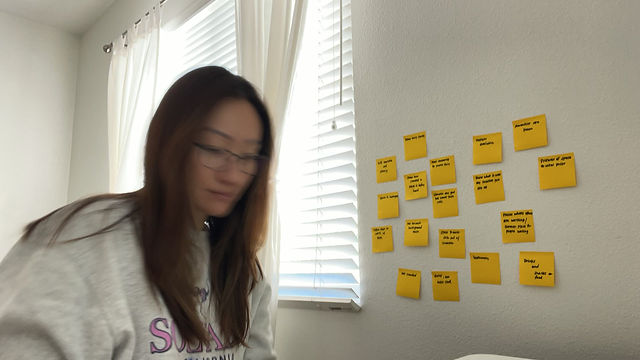
Noelle, fortunately, was one of two users that allowed a screenshot during the interview but asked her appearance to be covered if used on my case study.
Interview Observations
Finding volunteers was difficult due to severe allergy season, covid, and flu cases. This resulted in numerous reschedulings and at one point I decided to relieve some of the volunteers since scheduling was becoming difficult. Luckily I finished my interviews with new users to test the prototype.
The volunteers had no issue navigating through the app and noticed how clear each step was without any confusion. There was a suggestion to add a back button once you have clicked a cafe in case the user wants to view other options. The volunteers also noticed how the app felt intuitive and familiar without any hassle. Since the volunteers were setting aside time away from work, I was relieved to see that each user had no trouble understanding and navigating the app.