Project Details
Duration
9 Weeks
Team
Jennifer Jew
Sole UX/UI Designer
Tools
Figma and InVision
Insight
SubTracker has solely been used on desktops and needed to improve usability by broadening its user base with a mobile app. In order for the user to gain a clear overview of their subscriptions and make mindful decisions, a user-friendly platform was my focus.
Solution
SubTracker is an app that efficiently monitors and organizes all of your subscriptions in one place. SubTracker's role helps you stay ahead of recurring charges, easily budget your finances, and make decisions without being overwhelmed. Furthermore, SubTracker aims to expand its reach to the German market while actively growing its user base.
Design Process

Discover
User Interview
Personas
Synthesize
Competitive Research

Define
User Flow

Ideate
3 Panel Sketch

Design
Style Guide
UI Kit Design

Test
Usability Testing
Implement Feedback
User Interview
To better understand the users and confirm that the mobile version would be a smooth transition, it was crucial to receive user feedback on how users' experiences are with apps managing their subscriptions and finances.
Ana K. 34 yo
“The dashboard must have everything I want to see on a financial app...without it feeling overcrowded."
Brandon J. 37 yo
"I can't waste time trying to figure out how to cancel a subscription ."
Erin S. 43 yo
“Apps are not my first option to organize my subscriptions.”
Personas
Synthesizing from potential users how they organize their finances and subscriptions, the main goal is to display those patterns and identify pain points to further empathize with the users.
User Personas
This is your Team section. Briefly introduce the team then add their bios below. Click here to edit.

Lori S.
50 years old
Social Worker
Married with two children

Will G.
38 years old
Accountant Manager
Single with no dependents
Synthesize
Synthesize
Creating personas narratives deepened my empathy for potential users, providing a clearer grasp of their identities and goals. By synthesizing insights from User Interviews through categorization, labeling, and the "As a User, I want, So that" method, I enhanced the information architecture that shaped my design solutions.


Synthesizing
First Card Sorting
Insights gathered from user interviews, I used post-its to have a broader view of patterns and reoccurring themes that users were expressing.

Second Labeling
Narrowed down to popular statements and themes that stood out.
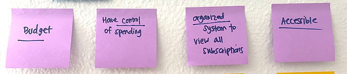
Third "As A User"
To stay focused on the user's needs, I used "As A User" statements to find possible solutions.

Competitive Research
I used Competitive Research to gain further insight into how to approach building SubTracker. Since SubTracker is a subscription-based app I chose ones I've heard of and seen ads for. I listed what I liked and disliked with each app, noticed Trim and Rocket Money had a mobile version, and that Plaid was commonly used to secure a user's bank to their respective app. Seeing how Plaid was used for Trim and Rocket Money, I trusted that Plaid must be connected with SubTracker as well.
Out of the three competitors, Rocket Money was closest to a mobile version of how I would design SubTracker; not overly simple like Trim and detailed as Track My Subs.


User Flow
After thoroughly synthesizing and doing competitive research, I generated a user flow that visually illustrates the steps users would take to accomplish particular tasks:
1) View all subscriptions
2) Cancel a subscription
3) Add additional money to savings.
This user flow provides an understanding of the user's journey and identifies potential areas for improvement or challenges.

3 Panel Solution Sketch
In tackling my low-fidelity sketches, I opted for a 3-panel solution sketch instead of wireframing since I planned to use a UI kit for my high-fidelity designs due to time constraints. The 3-panel design sketch centers around presenting a single solution for viewing all subscriptions with a user-friendly method to easily cancel a subscription.

Style Guide
I created a style guide despite using a UI Kit due to some aspects that needed more versatility. The style guide stayed close to the UI Kit as much as possible. Additionally, the guide emphasized the significance of user-centricity, accessibility, and scalability for future growth that complimented the UI Kit designs.
1) Iconography
2) Typography
3) Elements
4) Colors
Iconography
To keep the design as close to the UI Kit, I wanted to keep the iconography simple and minimal since the target audience mainly used SubTracker on the desktop and will now be transitioning to mobile.

Typography
Throughout the design process of SubTracker, a critical decision was made to adopt the Almarai Font that was used on the UI Kit. This deliberate choice stemmed from reviewing the UI Kit itself and seeing that it aligned with my commitment to alleviate any potential user anxiety or doubt when engaging with their financial information through the application.

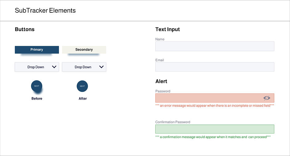
Elements
To stay consistent with the UI Kits elements, I added the Secondary button, Drop Down, and Alerts.
Colors
SubTracker's color palette was thoughtfully chosen to play a pivotal role in shaping SubTracker's identity. Beyond aesthetics, they influence user emotions and communicate the app's commitment to providing a seamless and reliable subscription management experience.

UI Kit Design
The UI Kit met many of the foundations that I needed for SubTracker. The kit was a guide that I was still able to personalize with typography, elements, and colors from the style guide. The graphs, verification, and transaction, along with setting a currency was helpful for my design decisions.


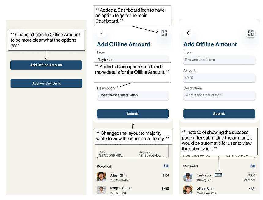
Prototype Redesign Feedback
From the usability findings I was able to apply the feedback on my designs below to create a more clear action with each screen.
First Redesign
From the feedback of my first round of user testing, I saw that it was necessary to redesign the concerns that were high.

Second Redesign
From the first redesign, I received more feedback. I decided on additional steps to view the latest cash amount added since users had mentioned they would head back to the main dashboard and start over to check on their submissions.

Third Redesign
My second design was not intuitive and I did not feel the title Cash Amount was clear to understand. I decided to take on a more intuitive and simplified process when wanting to add money manuelly.
Final Prototype
After all the user feedback and redesign, I was able to thoroughly complete my prototype with a more intuitive and user-friendly experience.
Reflection

During the user research process of SubTracker, I gained valuable insights into the trust levels among users when dealing with their finances in the digital realm. One observation was the frequency of desktop usage, particularly among users dealing with substantial sums of money. This indicated a strong preference for a broad overview that desktop platforms offer, promoting a sense of security and ease when managing significant financial transactions.
Another repeated response I noticed was the disparity in trust levels between different age groups. Users between the ages of 30 and 50 exhibited noticeable levels of trust in the digital space when it came to financial matters. This was particularly prevalent among the older age group, possibly due to a more traditional mindset and limited exposure to digital financial tools. Understanding this skepticism is crucial for tailoring SubTracker's user experience and providing additional reassurance to win over the trust of the older age group.
Whereas the younger age group displayed a more favorable disposition toward financial apps. As they tend to have fewer assets and less complex financial portfolios, they appeared more open to adopting digital solutions. This demographic's comfort with app-based financial management can be attributed to their exposure to technology from an early age and reliance on digital platforms for various aspects of their lives.
The next phase in enhancing SubTracker's value would be to incorporate a "Discover" feature. This feature would aim to present users with different ways to grow their money based on their specific financial standing. By providing tailored investment recommendations and educational resources within the app, we can empower users with the knowledge to take proactive steps toward their financial goals.
In conclusion, SubTracker's development journey has been an eye-opening experience, revealing the significance of user preferences and trust levels. The next phase of SubTracker's evolution is where I aim to build further trust among users, provide a seamless desktop experience, and foster financial growth through a personalized "Discover" feature.