

Teammate was created to improve your airport nuances by knowing wait times and pre-order needs within the same app as your boarding passes.
Teammate

Role: UX/UI Designer and researcher
Tools: Figma, Miro, and Marvel
Project Duration: 5 months
Client: Springboard UX/UI Design Program
Process:
* Discovery
* Ideation
* Design Process
* User Testing
* Redesign
* Reflection

Problem
There are apps for each airline yet the airport is the prominent place where one can have an overwhelming experience especially when dependents are involved. Surprisingly, directories are unavailable, flight information is everywhere, and parents with dependents are having to navigate among people with lines spread across the airport.
Goals
To provide a less anxious experience at airports for families by creating accessible and convenient solutions.
1
Be In The Know
-
Interactive maps to direct and navigate through the airport facilities.
-
Know wait times for security checkpoints.
-
Receive real-time flight information.
2
Plan Ahead
-
Checklist to reference in the same app.
-
Pre-order from shops listed nearest to the gate.
-
Pre-order food with an option for delivery to or pick up.
3
Reserve Assistance
-
Effortlessly reserve medical devices and receive them at a designated location.
-
Have airport assistance agents help families with baggage or those that need help pushing a wheelchair.
Design Process
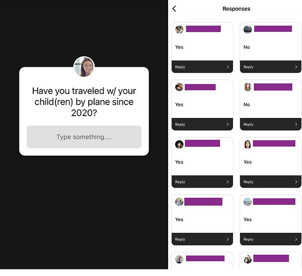
Pre-Screening Survey
I have significantly noticed the change from traveling without dependents to with them. Without jumping to conclusions, I wanted to hear from other parents as to how their airport experiences have been. Caution was taken into account since covid is still prevalent, I created a short survey via Instagram story to gather as many responses. Then narrowed it down to five volunteers to gain deeper insight.
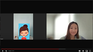
Interviews
From pre-screening a wide range of users, I was able to narrow down to 5 volunteers to proceed with gathering information from their travels since 2020. We were able to agree that Zoom and a couple of in-person interviews were best since I wanted to respect their busy schedules along with their personal space with covid still prevalent.

User Journey Map
Synthesize
From the interview's verbal and nonverbal responses, I made sense of the handful of data and prioritized the user's needs by using post-its to easily rearrange. The post-it method also helped with stepping away and viewing it with a broader perspective.


.jpg)
Empathy Mapping
Empathy mapping was to fully understand and mirror the user's behaviors and expressions when at the airport with dependents. I was able to not only gather what the users say, but also their hopes, expectations, and limitations.

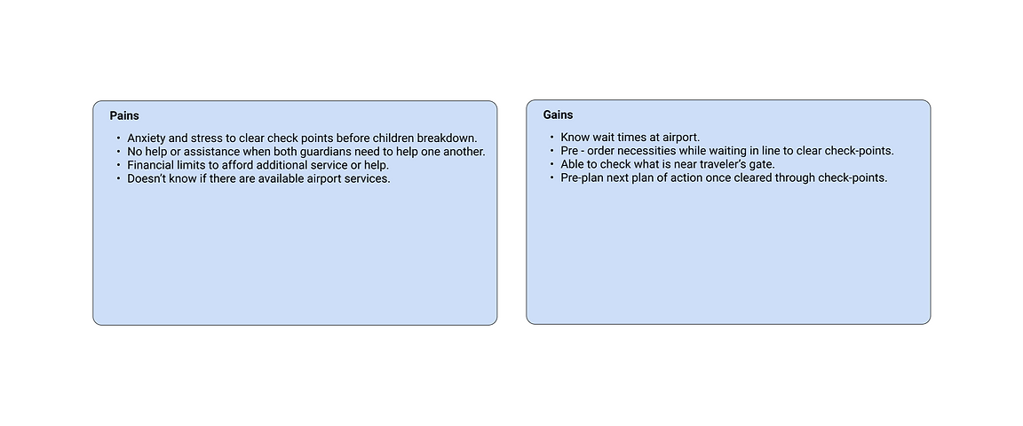
Pains and Gains
To keep the focus on the user, I summarized specific pain points of a user's obstacles and gains of beneficial aspects of the app. This process helped me to understand the reason behind some actions a user would possibly take and shift focus from the product to the users who are going to use the app.
Persona and Journey Mapping
Personas
From Empathy Mapping I created two personas to understand behaviors within the context of using the Teammate app. One commonality that I found was that regardless of occupation or additional adult travelers, both moms held responsibilities when it came to children-related necessities.

Priscila
Occupation: Stay-at-home mom
Age: Early 30's
Status: Married
Dependents: 3 Children: 5yo, 4yo, 2yo
Role: Main organizer for all things related to children pre-boarding and on the plane.
No additional help when traveling on a plane. The recent airport experience created high anxiety and stress that the next travels ended up being 2-3 day road trips.
Ideation
Creating a target audience through Empathy Mapping and Personas was a challenge in keeping my own experiences secondary. I used How Might We questions to frame the statements to stay focused on what I synthesized to appropriately design solutions.

User Flow Chart
The user flow chart was set up from the How Might We practice because it provided possible solutions to approach the routes a user would take. This was an important step also to identify dead ends that needed attention and understanding how a user navigated through the app.

Sketching
My User Flow Chart helped me visualize routes to see how users would navigate the app. I sketched on paper to receive initial feedback on designs to learn how the user would interact with Teammate, how intuitive it is, and if there were any aspects I may have missed. The lo-fidelity sketching provided flexibility for modifications along with seeing each step more clearly.

Wireframing
After finding what was missing from my sketches, I cross-checked with my user flow chart and added the missing screens to create my wireframes with better insight. I may have spent more time than the time frame given for the project, but I wanted to design as closely as I can when working on my hi-fidelity stage.

Color
I used the following colors that would evoke certain emotions and meanings to counterbalance any hectic or stressful situation an individual may be in while using the app.
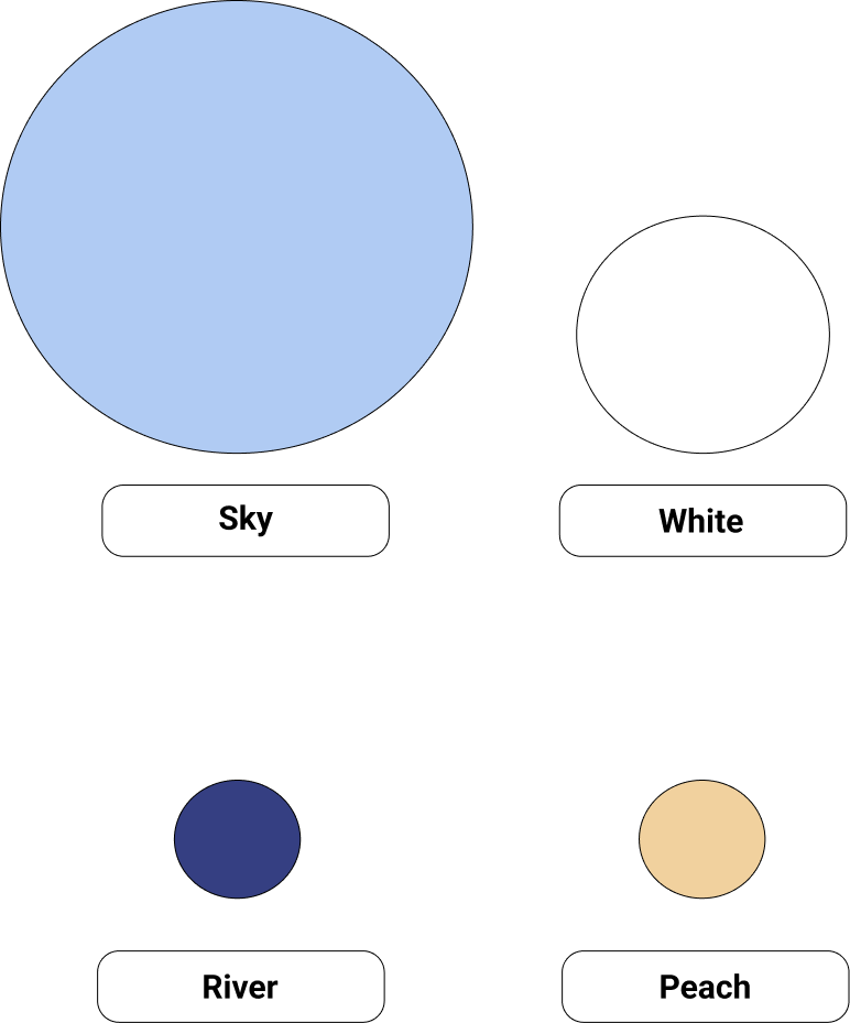
Primary
-
Balance
-
Tranquility
Secondary
-
Pure
-
Starting new
Accent
-
Compassionate
-
Dependable
Accent
-
Sweet
-
Pleasant
Typography
Due to the nature of the airport, family life, and busyness, I focused to keep the typography clear and simple to keep the information to the point.

Prototyping
I created hi-fidelity designs on Figma to prototype for users to test through the Marvel app that creates a basic interactive experience. I conducted 5 usability testing with set routes for users to complete to view if the app process was intuitive and helpful to have the user's needs in one app. Also regardless of where the user was being tested, I observed how they were able to navigate through peaceful and distracting environments.
Routes users were tested for:
1) Sign Up: Users were able to sign up without any trouble. They also saw the benefit of having notifications and location tracking on when using the app.
2) Pre-order Food: Since there are food delivery apps that most of my users have used, I created the layout to be similar to Yelp to lessen their learning curve.
3) Reserve: There was no issue when it came to reserving a wheelchair since each step was clear and easy to use.
Feedback From User Testing
The users first initial reactions were how they wished this app was and is available for use to help lessen airport anxiety. The colors used were not distracting and were well received by how simple it was to view each page when going through the routes. I focused on the comparison screens for each page to make adjustments. For example, a slight change by adding a notification indicator to the profile increases intuitive steps for the user to feel reassurance and confirmation a reservation is in place.
Feedback - 1st Draft:
White spacing needed to be utilized better and remove underlines on buttons to understand what is a link and what is a button.

Feedback - 2nd Draft:
Increased font sizes from 14px to 16px and spaced and enlarged icon images for easier visibility.
Changed the Submit button color from peach to river blue to lessen confusion about what to do next.

Feedback - 3rd Draft:
Included a status page along with a notification indicator at the top right next to the profile icon. This helped users to be in the know if their reservation went through and was pending with the option to check on the status of where it is at.

Reflection
This capstone project was created for a stress-free experience at the airport for those with dependents. Interview questions and user tests, helped me gather enough insight which guided my process of creating solutions by understanding the user's frustrations and obstacles. Keeping the focus on the user over my own airport experiences was a practice I began to develop when designing. During the testing stage of my sketches, I saw the app's learning curve was not difficult, which confirmed an effortless process and secured how I would design the rest of the app. I was able to create a product that integrates what current airline apps have and provides wait times for food and rides as they do at amusement parks.
If there was version 2 of Teammate, a critical feature I would improve is integrating the booking travel portion within the same app. I would also modify how the user can cancel or delay an order/reservation if they are not able to meet the confirmed time frame submitted. This would be a top priority for me to implement a solution.
For the time being, Teammate was received with enthusiasm by my generous volunteers that tested the app. After going through the design process, I see that Teammate is not just another airline app but an asset that elevates one's pre-boarding travel experience to feel more assured the trip will be a rewarding one.
I plan to approach my future projects with a learner's mindset since an experience can always be enhanced and that alone creates a lasting impression.